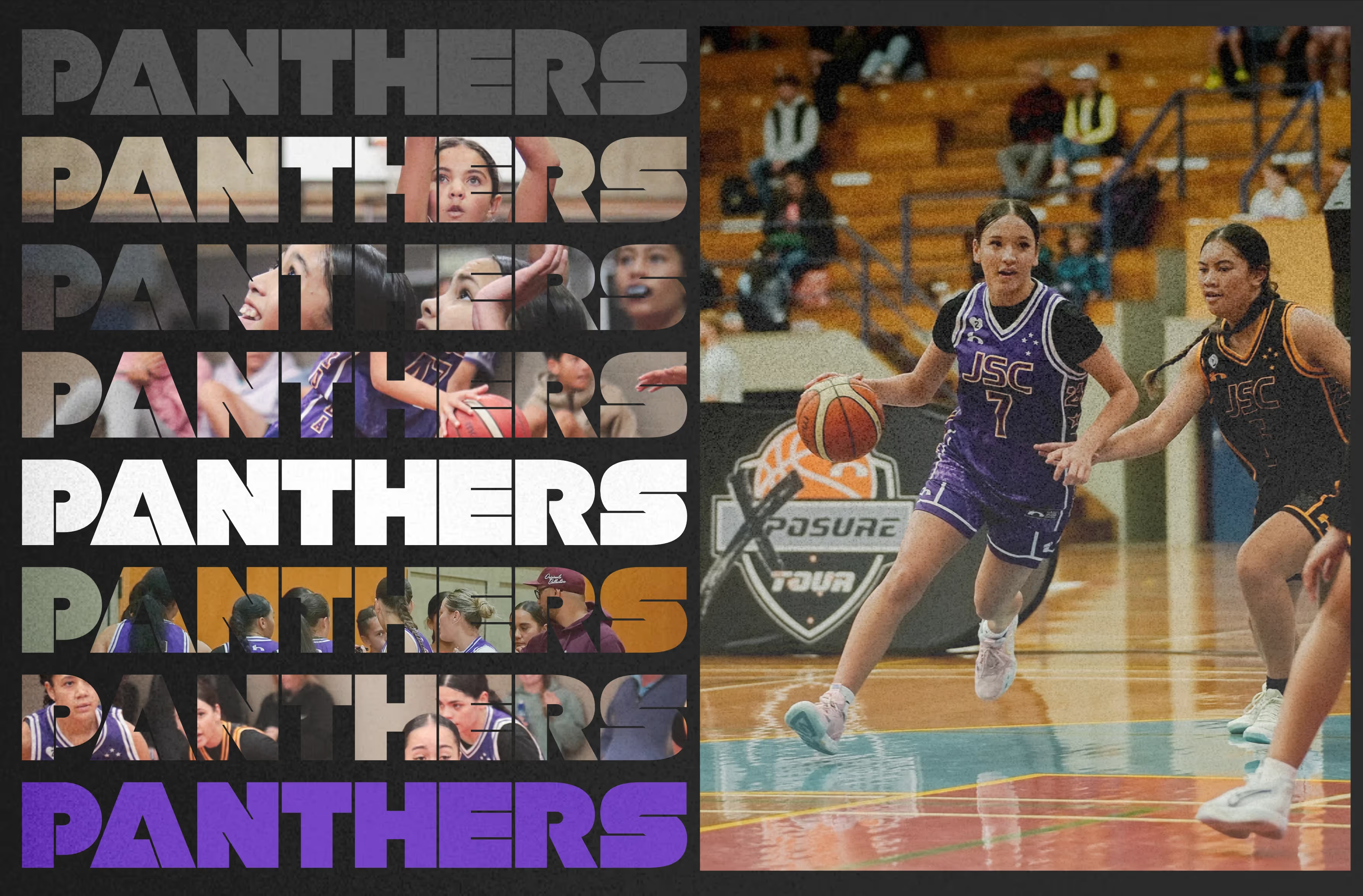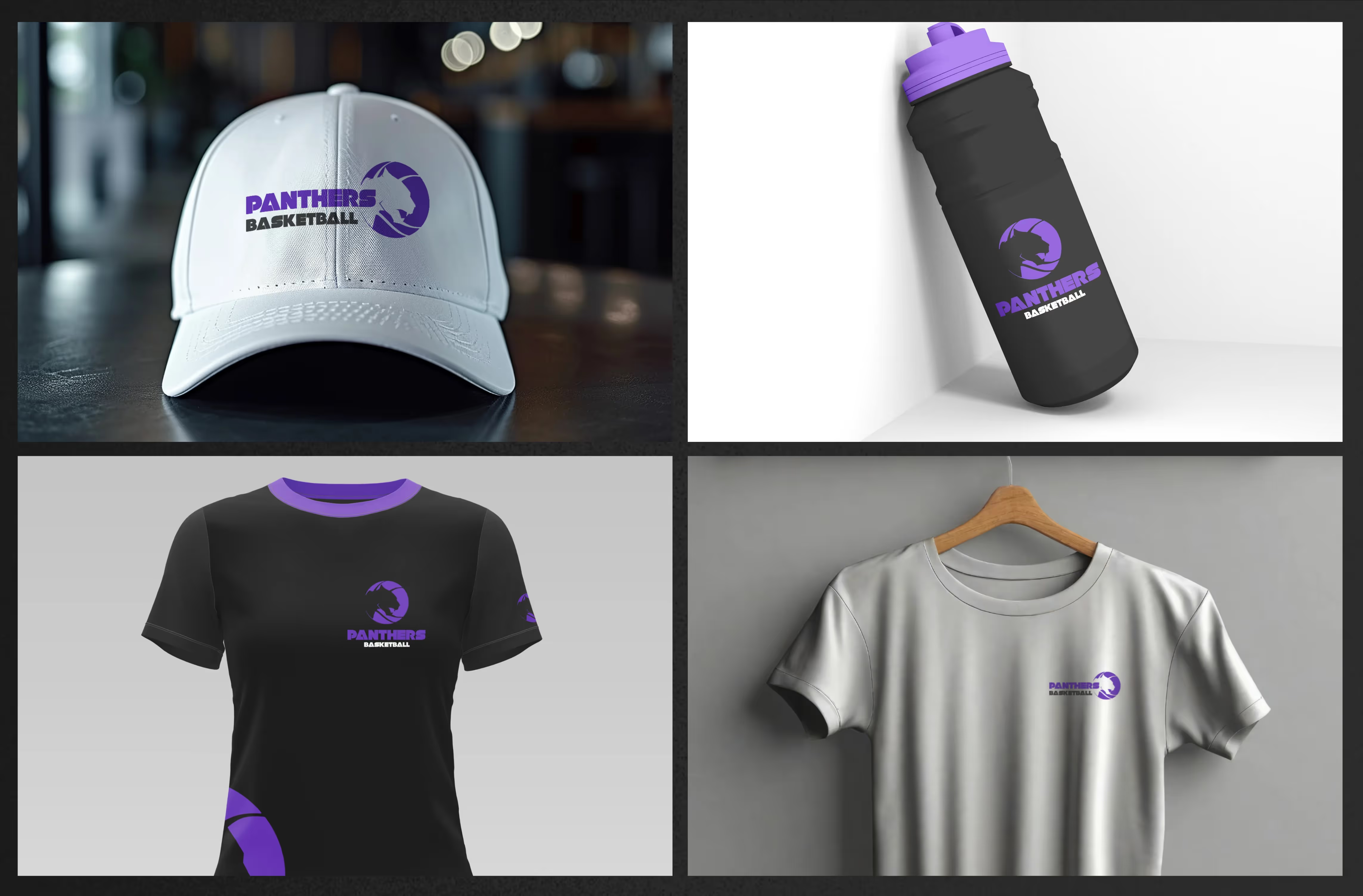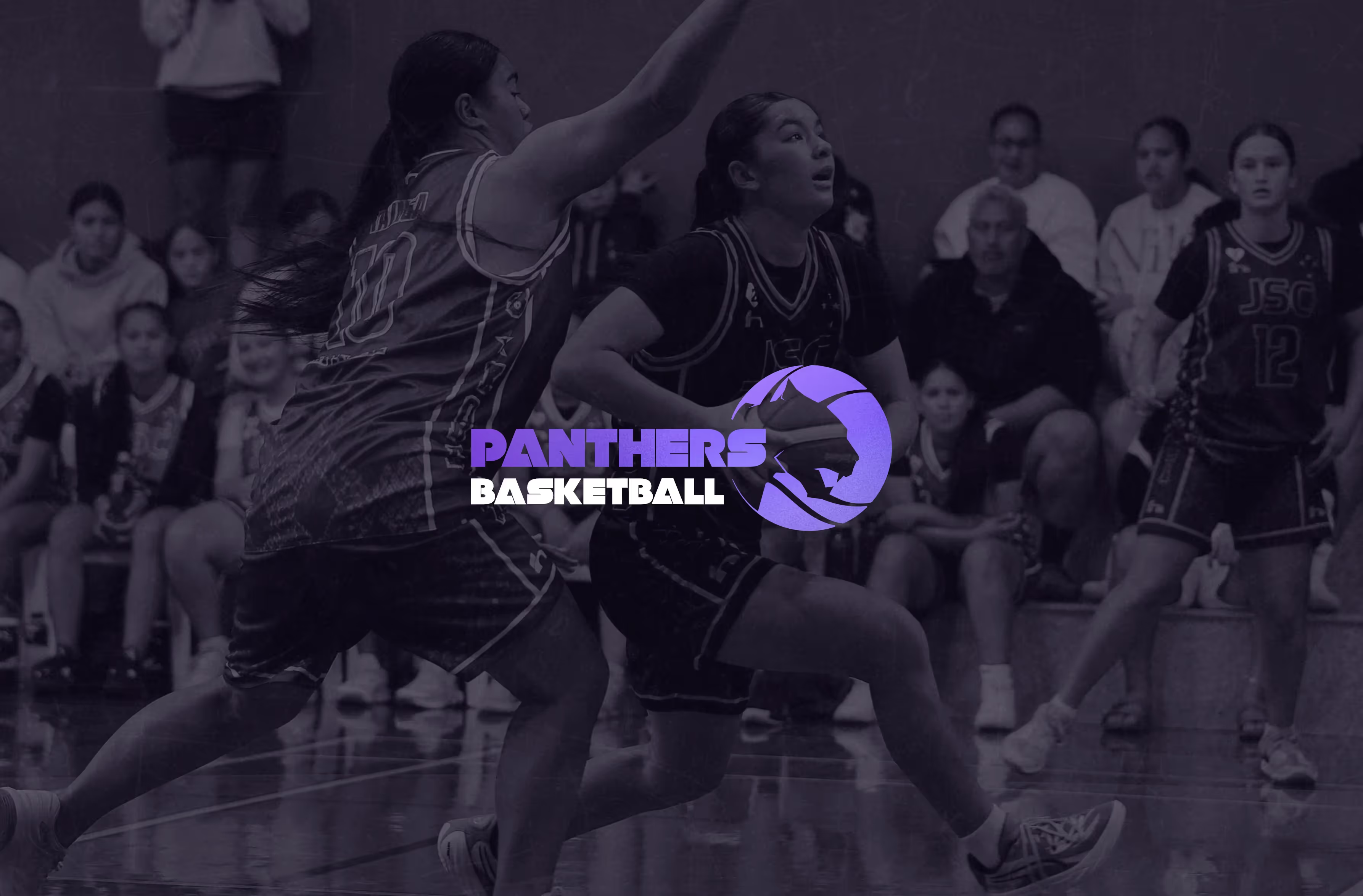


Tauranga girls team, Panthers Basketball needed a brand identity to fit the presence of their exciting new team.
Not all projects get off the ground and this is one of them ( we’ll get into that later ) but I enjoyed the process and the final outcome of this one so thought I’d share it.
I’ve worked with Paul on many projects through our Hoopnation connection and he approached me to create a team logo for a basketball team here in Tauranga.
Panthers Basketball team needed a logo to represent the team, with the brief of something slick and modern with a colour way of purple and black so I set about coming up with something unique and recognisable.
The logo initially started as a geometric face on panther head but something about it didn’t quite look right so we went back to sketching out a few ideas and how we could incorporate some form of basketball reference into that icon. We ended up as you can see illustrating a straight lined silhouette of a panther head and incorporating that into a ball shape to form the base of our icon. Next we needed a modern and strong font that would fit the dynamic of the team.
We presented the logo giving the team the option to use the logo vertically stacked as well as horizontally displayed or just using the icon for the team.
Unfortunately after some debate the team decided the name wasn’t quite right so it’s back to the drawing board for now.
