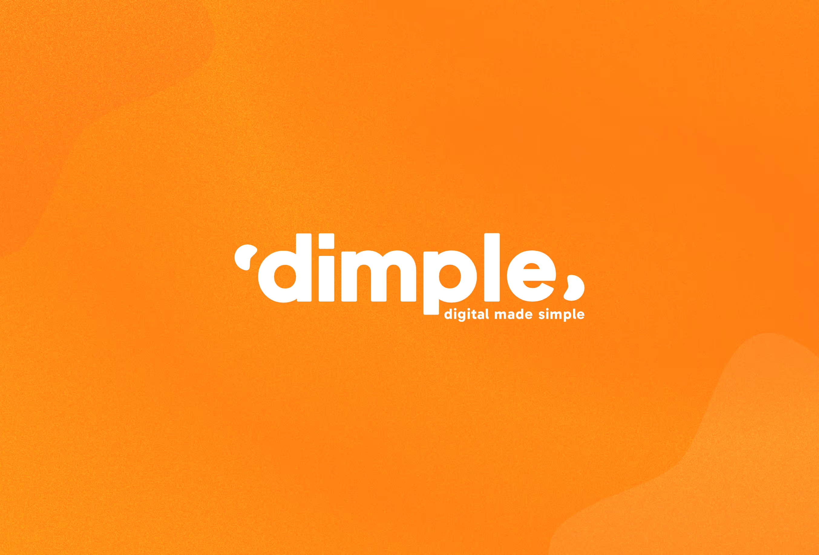


Dimple ( Digital Made Simple ) wanted a brand refresh to celebrate their 5th birthday and their continued growth and success and approached us to create something inviting,friendly and modern.
We’ve worked with David ( Founder of Dimple ) and Renata ( Marketing champ ) for a number of years and welcomed the opportunity to pitch for the rebrand of Dimple.
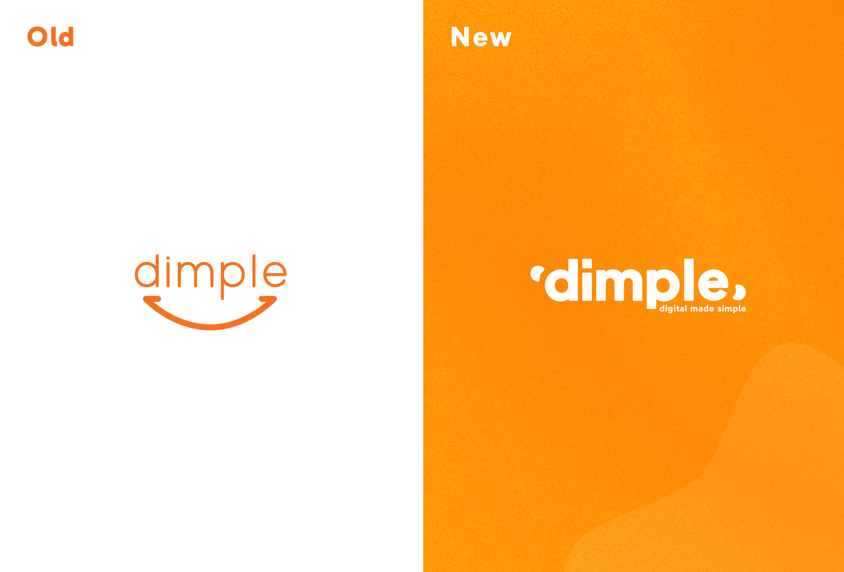
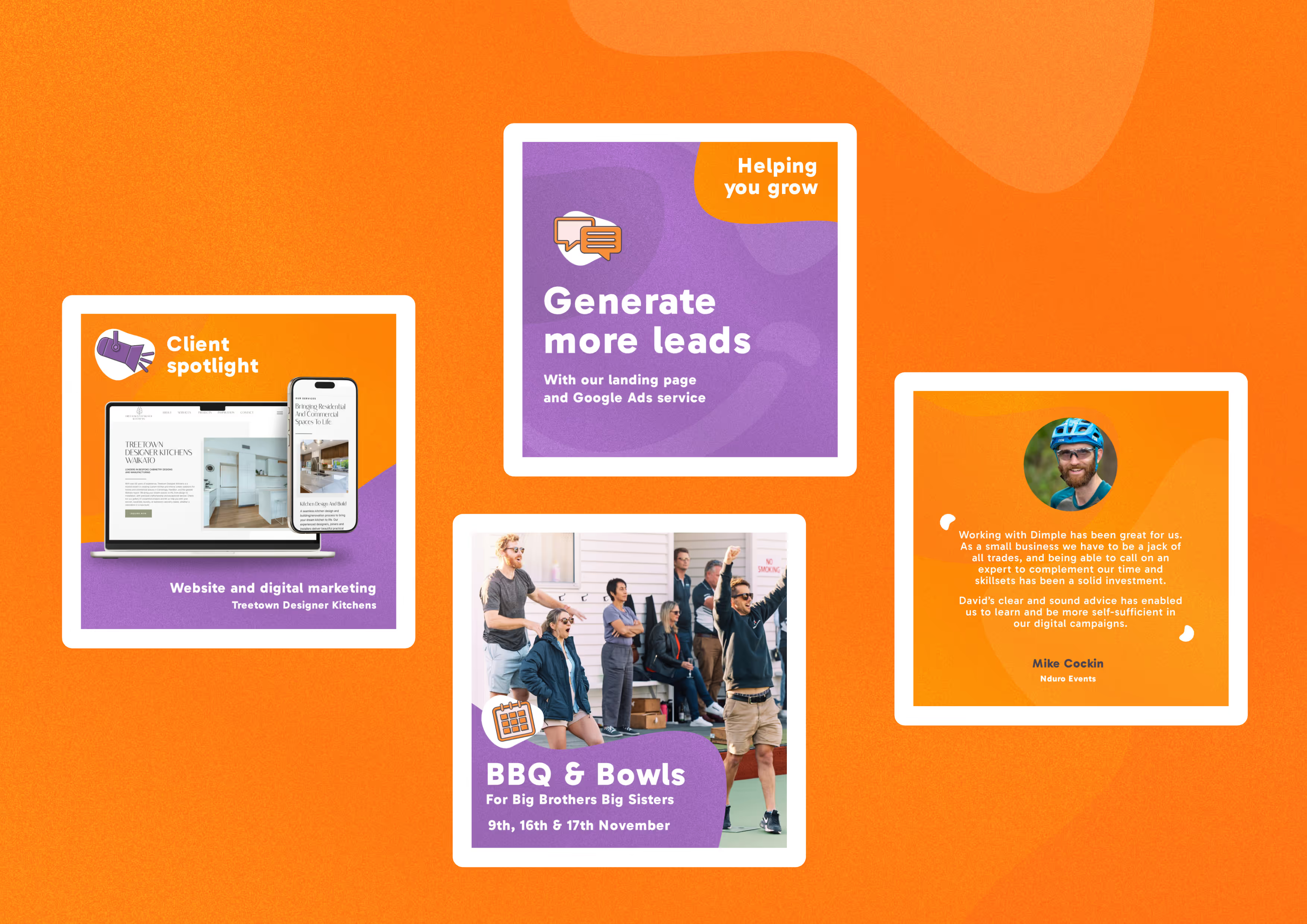
David wanted a bolder look as his marketing company were growing, one that was brighter and more modern. He didn’t want a complete change in direction, just a development on what he had. He also wanted us to look at how the new brand could be used in social media, in presentations as well as a concept for what the homepage might look like with that new brand used.
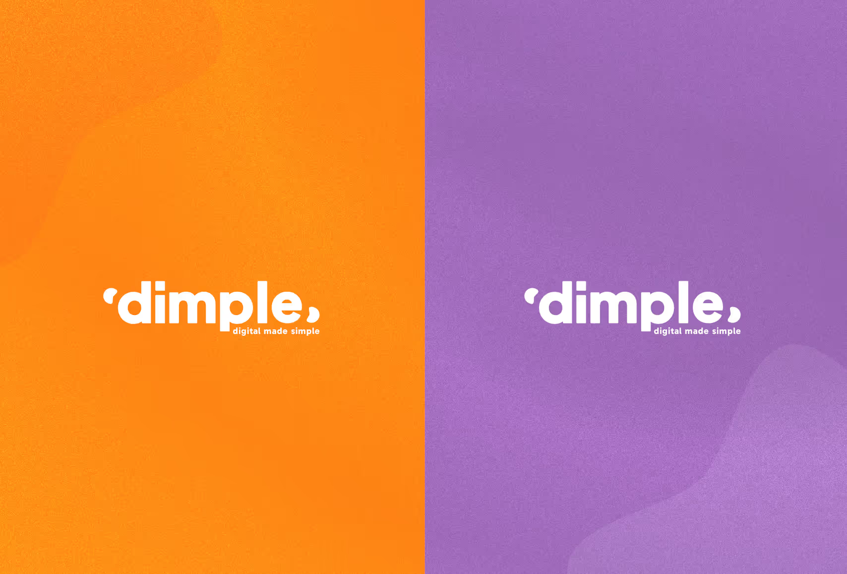
We jumped at the chance to work with the dimple team - after all dollop and dimple has a fun ring to it. We knew they wanted to keep the orange but felt we could brighten that u by adding a little gradient with and orangey yellow into the mix and adding some texture into the brand
We also looked at a wider colour palette that could work in unison with the orange to add creator variety to the brand and picked a shade of purple that complimented the orange and stood out when used together.
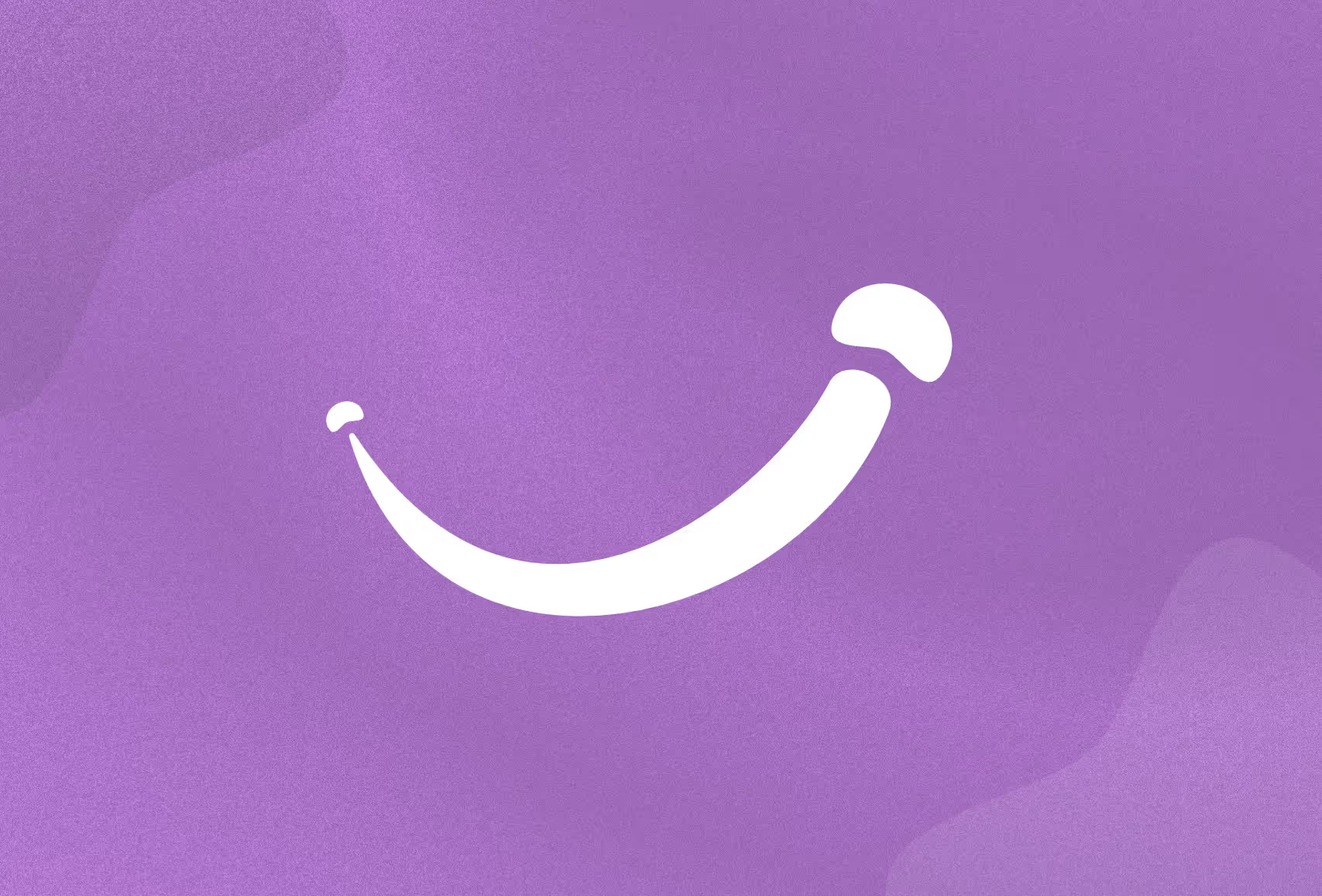
When it came to the logo - the name dimple evokes images of smiles and the shapes that form and one of the requirements of the brand was to create a smile icon that could be used as a brand element.
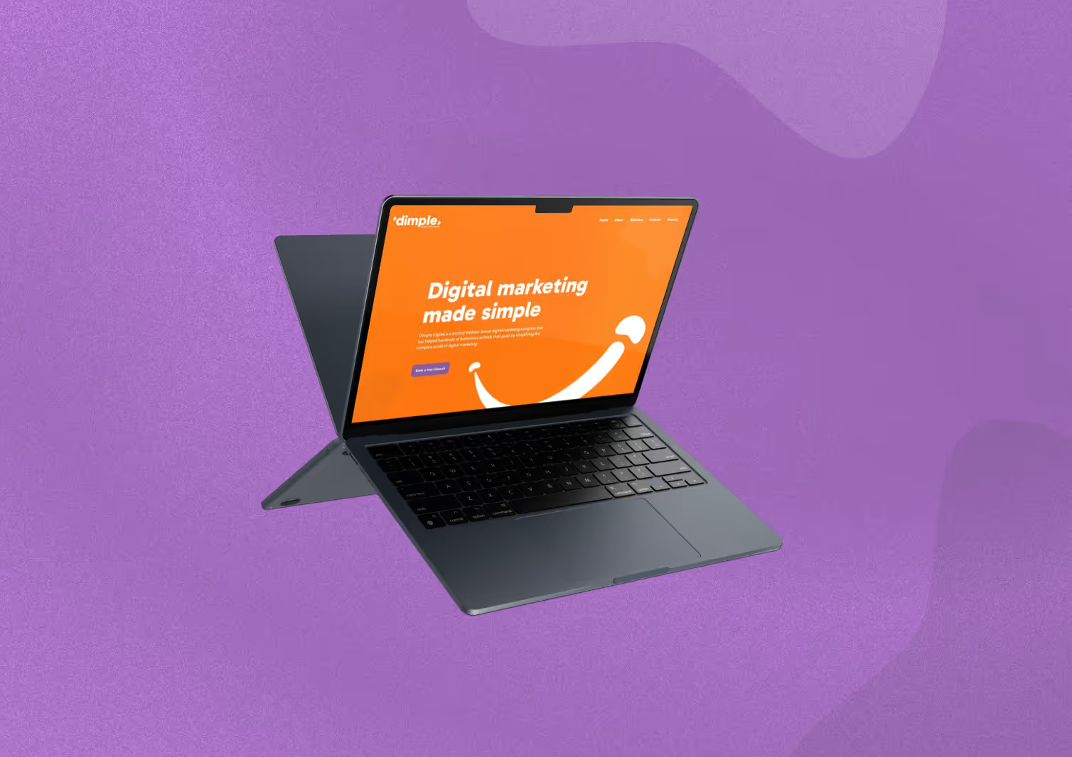
We looked at ways of incorporating the dimples into the lettering of the logo and thought we’d come up with a smashing way of using them but the font wasn’t quite right for the team. Back to the drawing board and we worked up a few more concepts before presenting them back, showing how the brand would look in situ, how the colours could be implemented and how this all translates into a working website concept. Luckily our second effort ticked all the boxes and we’d delivered a modern and approachable brand fit for purpose
All in all we delivered a refreshed brand identity, a set of social media assets and icons to be used, an infographic celebrating milestones and deliverables over the 5 years Dimple had been in business and a concept of how the brand would look online as well as the requested smile.
A really fun project to work on and great to be involved in Dimples celebrations for reaching 5 years in business. We hope the eye catching brand catches the eye and the professional new look only helps to keep the company growing
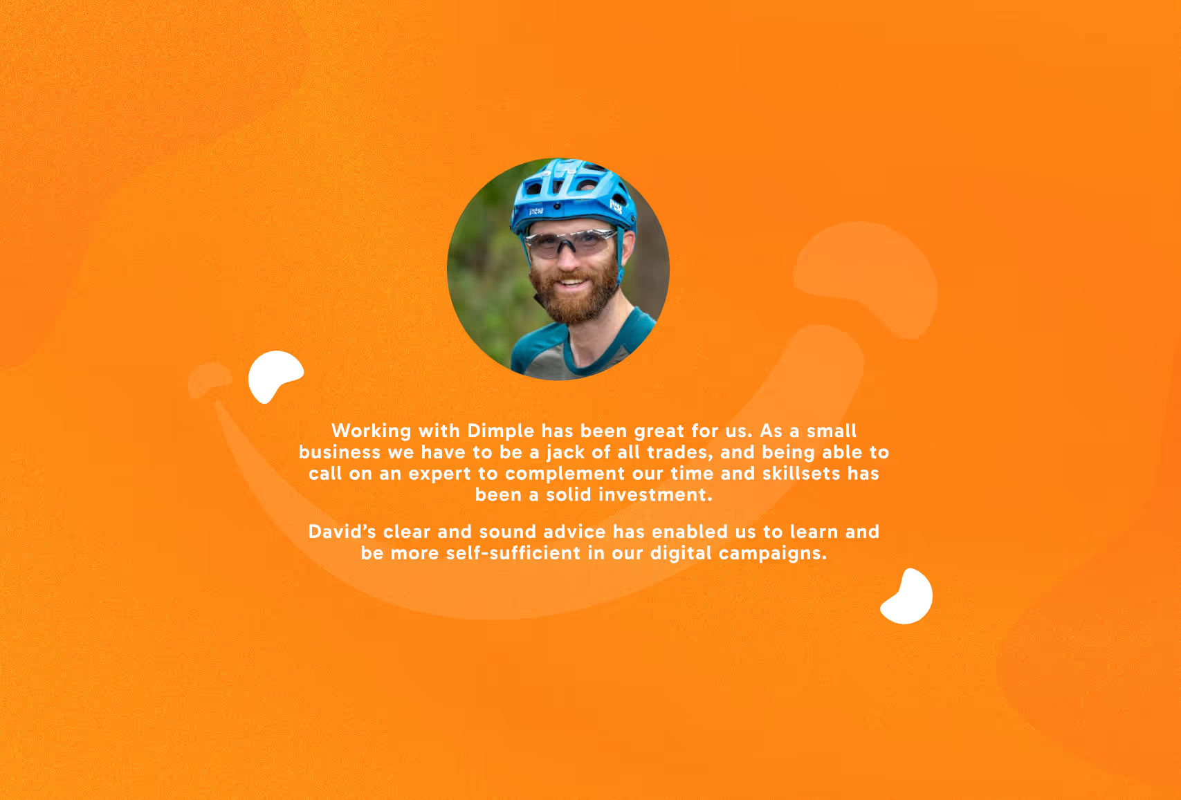
Alex is fantastic to work with. He looked after our refresh and illustrations. My goal was to significantly elevate our visuals while still maintaining a playful and friendly feel. Alex delivered a truly fantastic result! We have been able to elevate our brand to be more professional, which has helped my business grow substantially. Alex brings a level of care, detail, and passion to his work that you rarely experience. I couldn't recommend Alex highly enough. If you are wanting to develop the brand for your business, he is absolutely your go-to person.