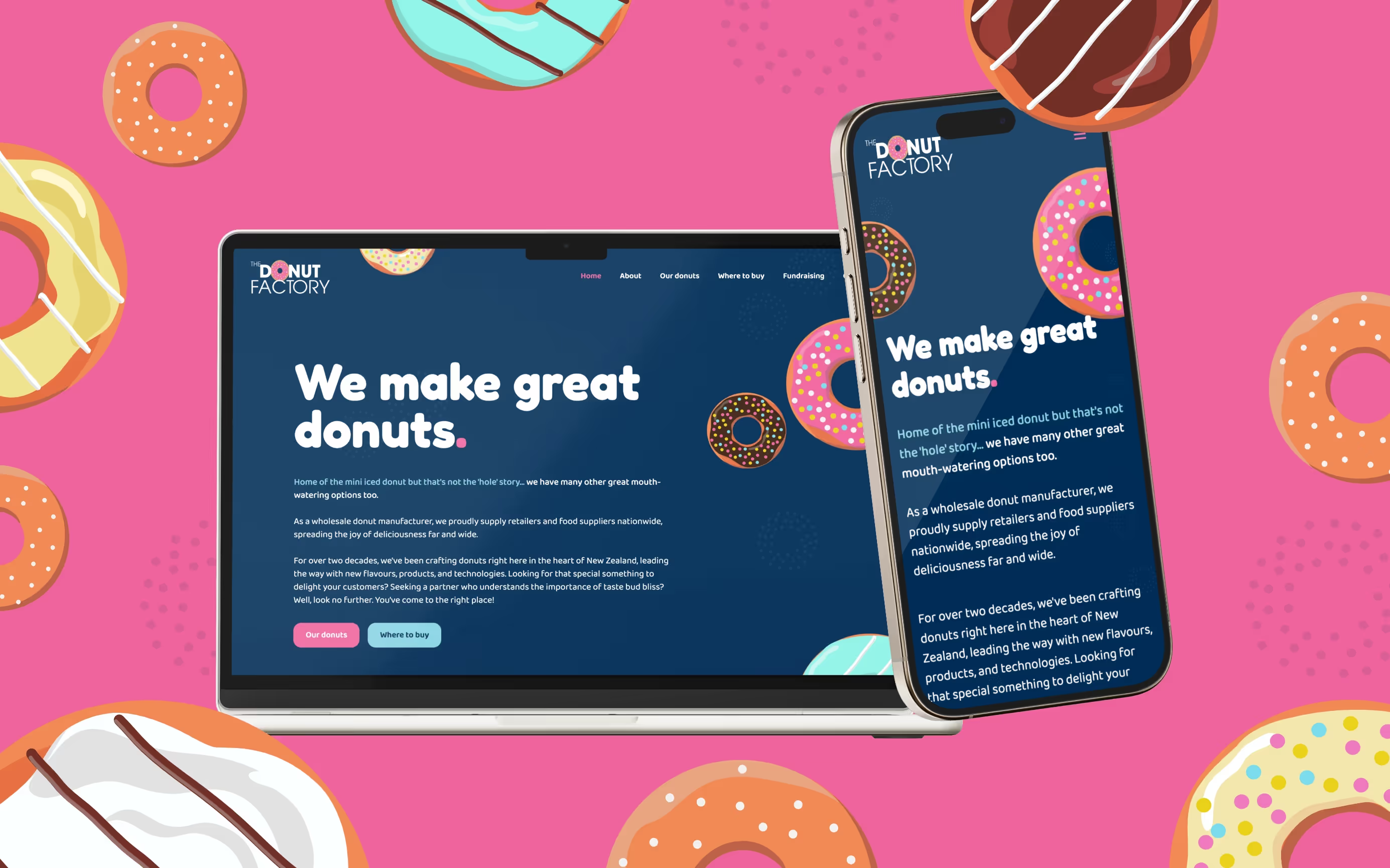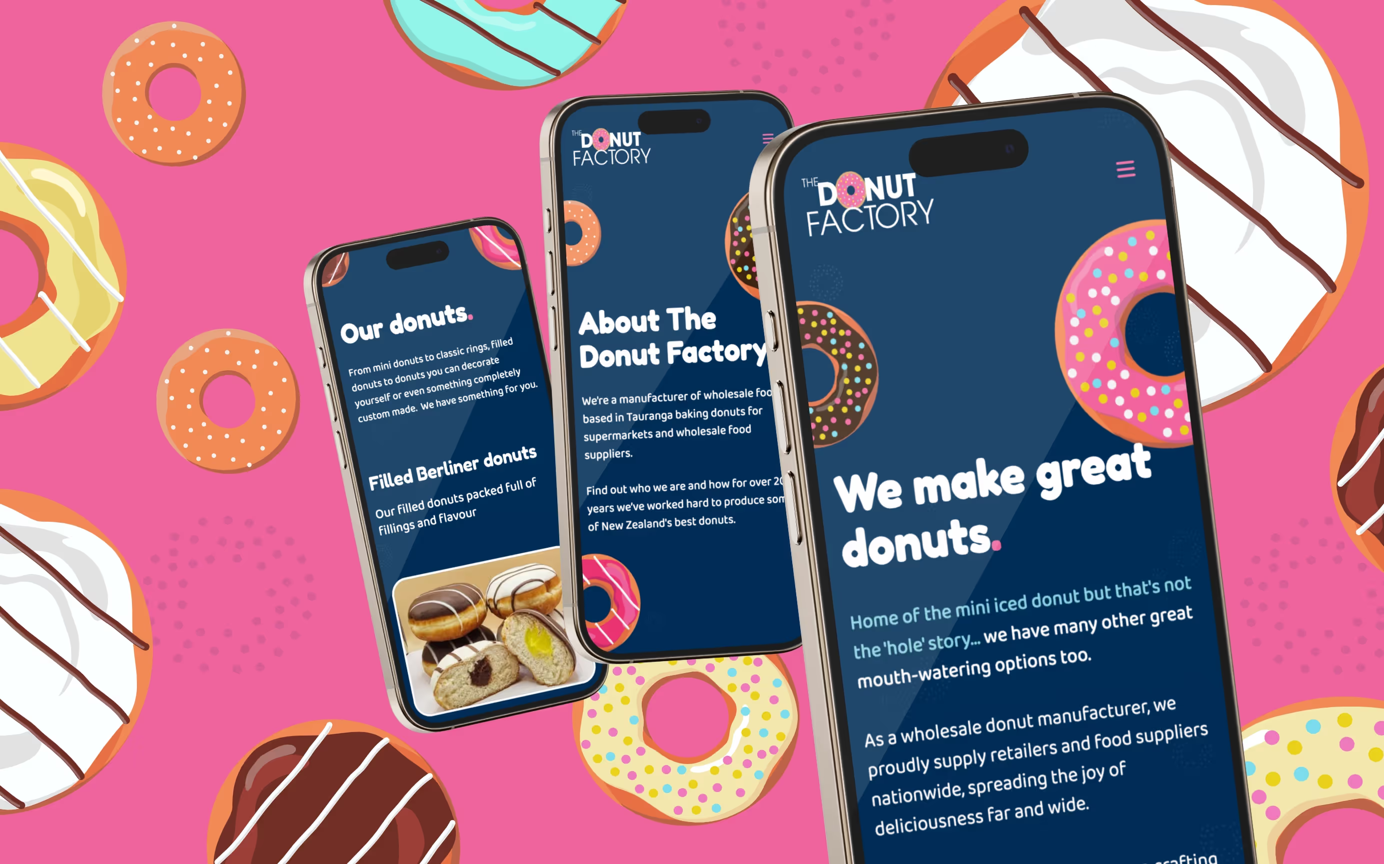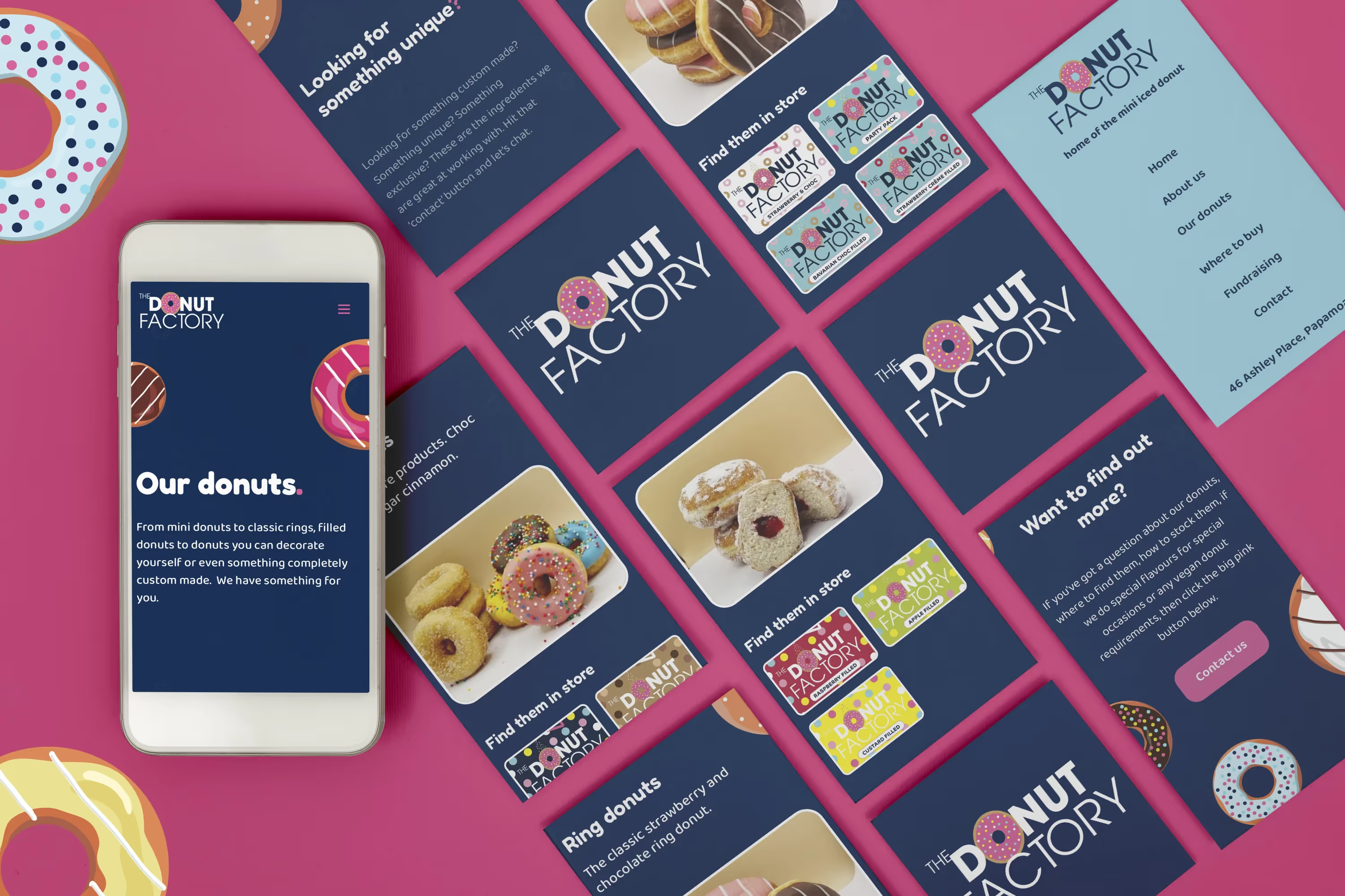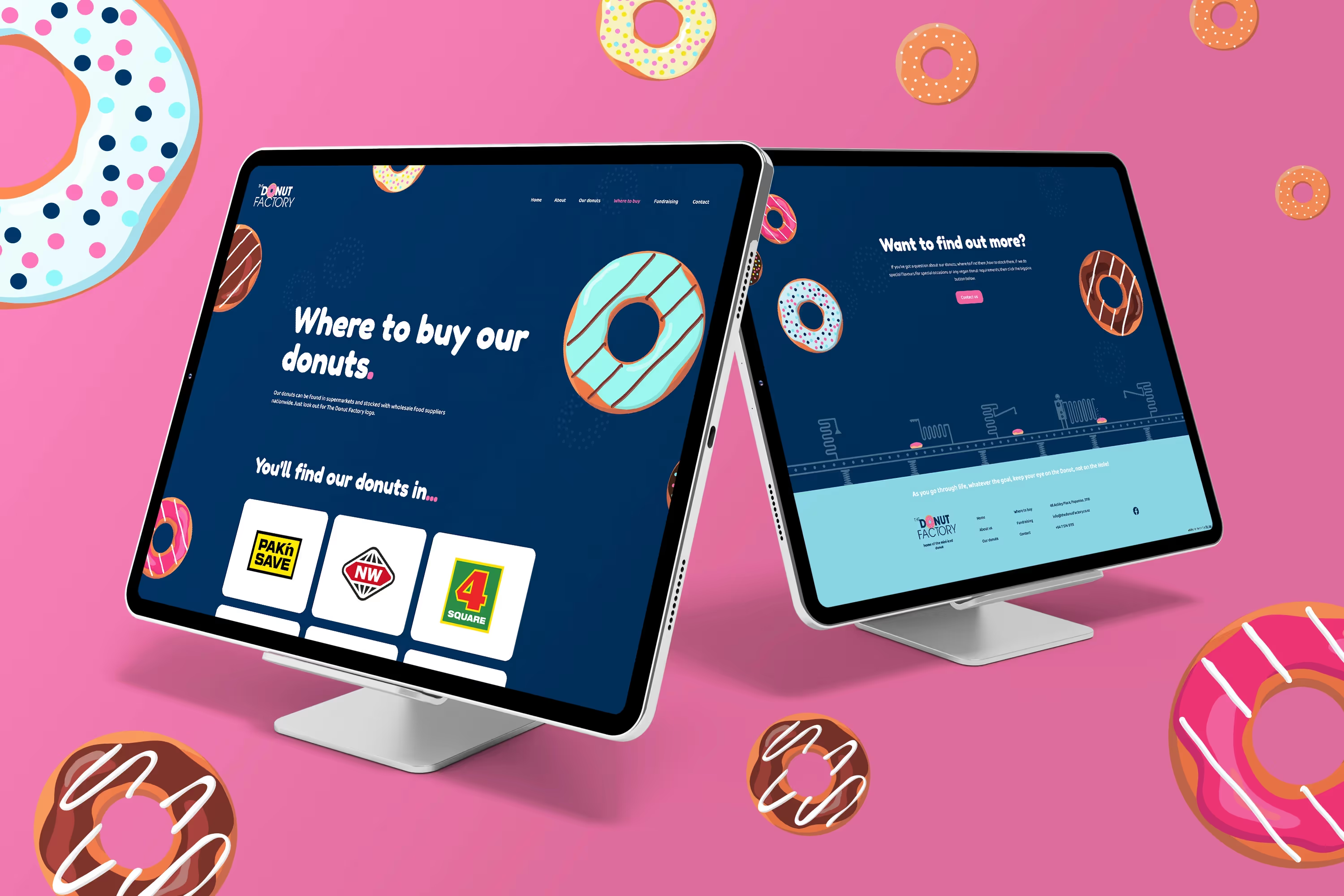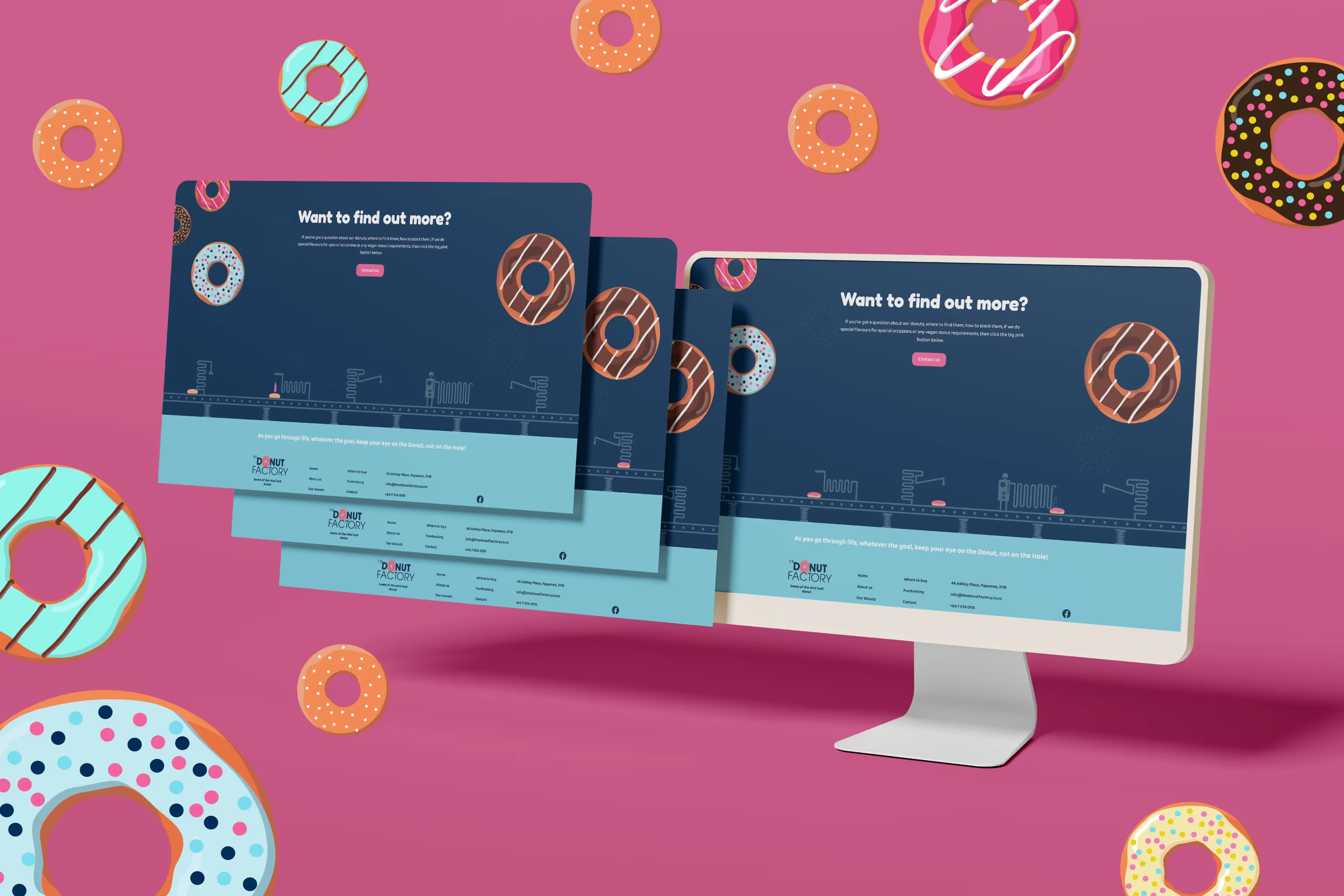


An established business but no real online presence to direct enquiries or direct potential customers too. Jon asked asked us to build him a website that would solve this problem and help him to grow.
I’ve known Jon, for many years and I've been lucky enough to sample his delicious donuts on many occasions - you really must try them.. Check the website to find out where you can find them
He approached me with the problem that he had an established business but no real online presence to direct enquiries or direct potential customers to. He wanted to make sure people realised they produce donuts in bulk and don’t have a little shop for customers to come and buy directly. He also wanted the site to be fun and not be serious and stiff and memorable.
In terms of the brand there wasn’t much to go on other than some packaging and a logo that featured an illustrated donut so we took that as our inspiration to bring a lot of illustration into the site as well as a lot of engaging movement and scrolling interaction to create a sense of being approachable and fun. We matched that with a friendly font and lots of bold headings and short form copy to help engage the user and direct them to where they wanted to be. We wanted to design the site in a way that really flowed as you scrolled and engaged the user to keep working down the page.
This was one of my favourite websites to design and build, I loved having fun with the animations and making the site move and bounce. Donuts should be fun and we think we delivered a site that not only fit the brief to give The Donut Factory an online presence also showcase them as a fun community driven business ready to serve delicious donuts across New Zealand.
