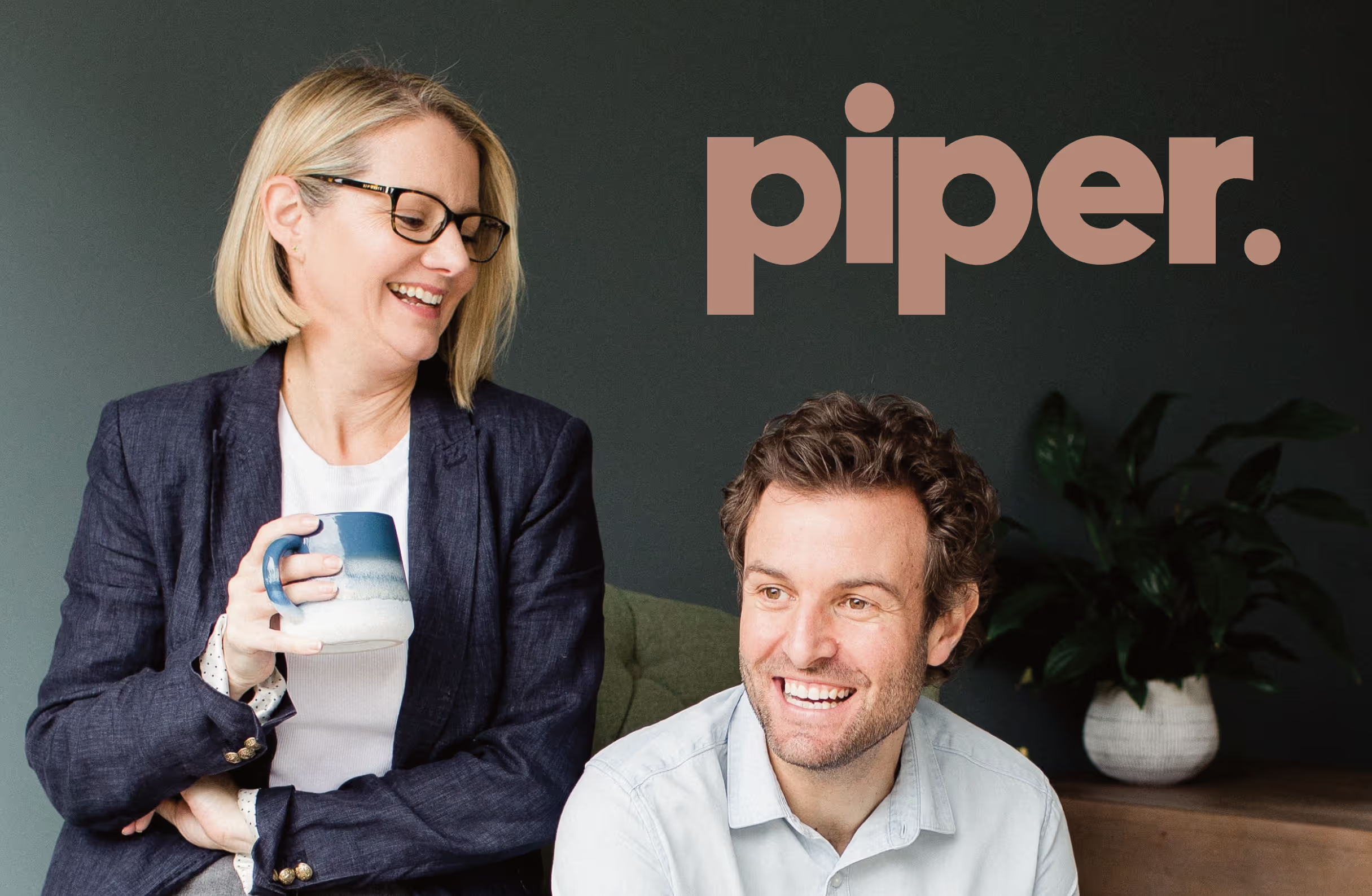


Piper are growing and expanding their business offerings and wanted a new identity and website to help maintain that growth and really highlight the skills they offer.
Josie started Piper back in 2020 and was soon joined by husband Tim in 2022. I've been great friends with both of them for many years and was chuffed when they asked if I'd be interested in giving them a fancy new brand as well as a website that clearly represented the four pillars of complimentary services that Piper offers.
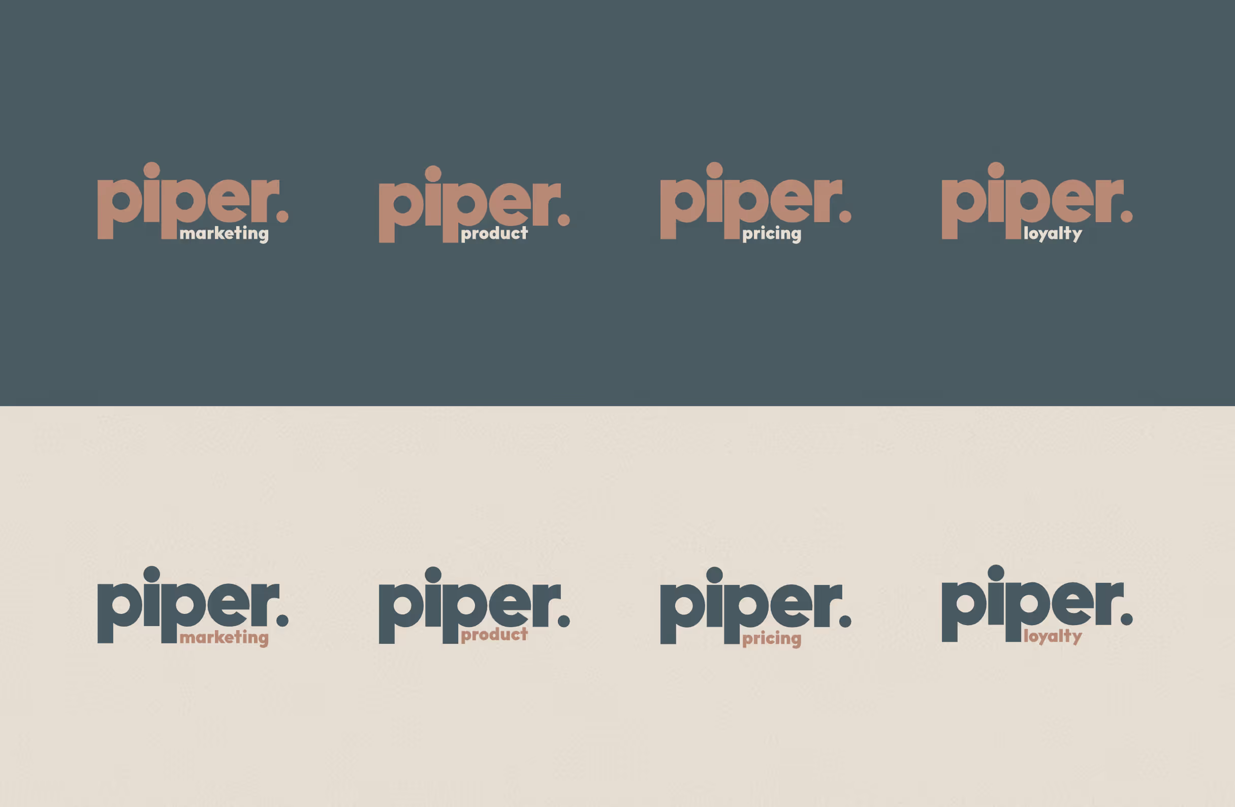
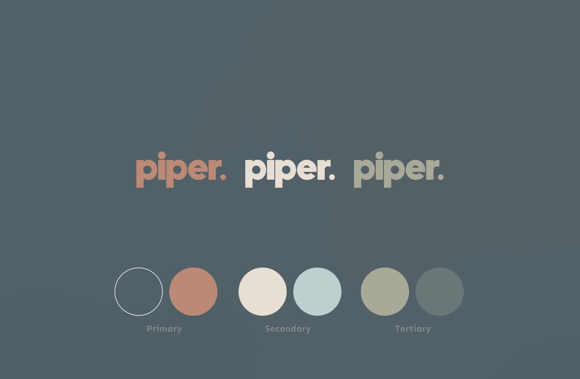
The branding brief was to deliver a modern looking logo that would also have recognisable sub-brands within Piper. Josie and Tim had an idea of the main colour and shade they wanted and I worked with them to establish a cohesive palette of colours that brought the whole thing together.
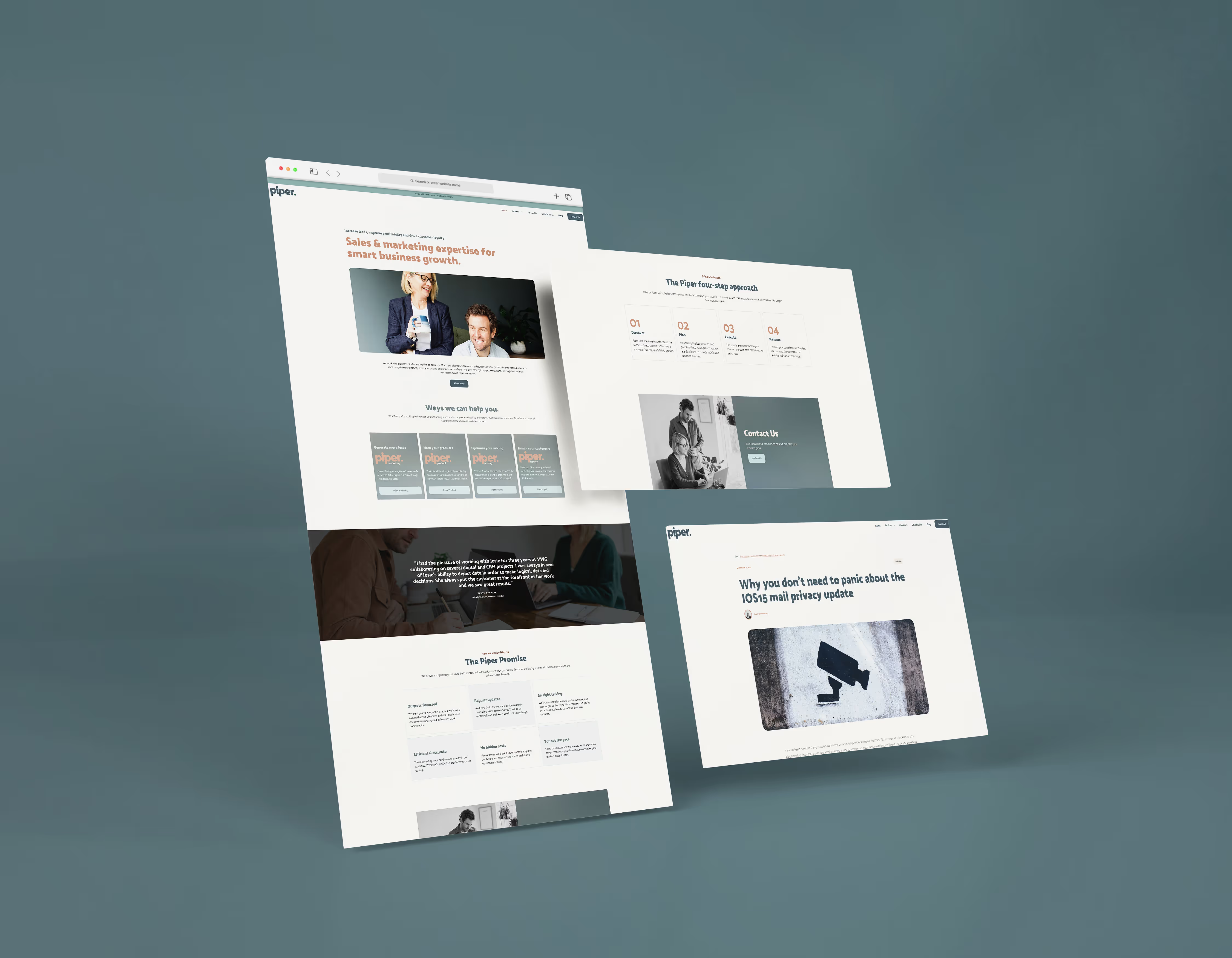
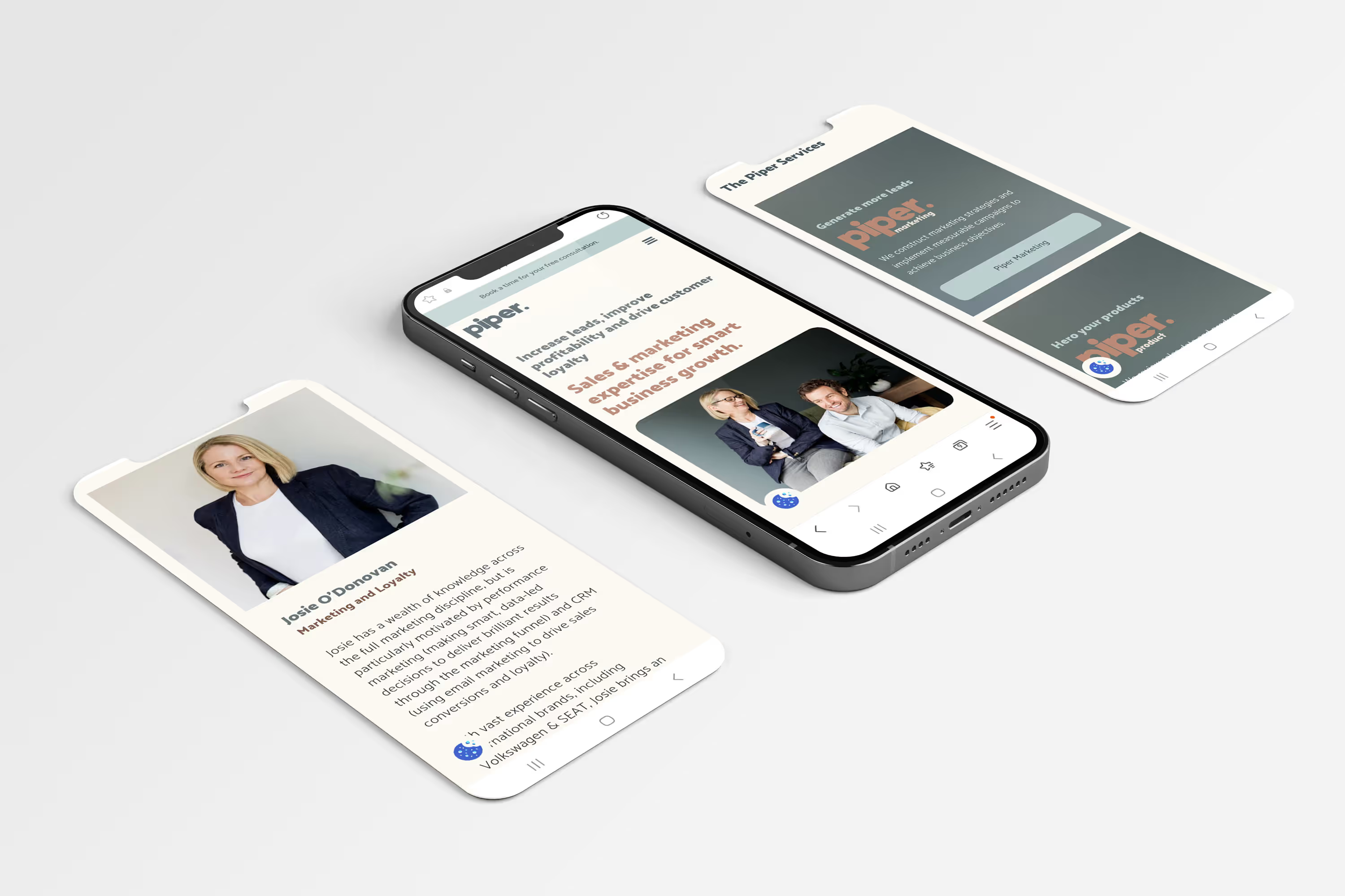
Following the brand work, we planned how the site would function, the content mapping and worked out what their website needed to improve on the previous site as well as showcasing their expertise and how their services can aid other business. We worked together at every step of the process, making sure wireframes and design concepts aligned with their vision before going into the build.
Piper were great clients to work with and are really good at what they do. I'd highly recommend them and I can't wait to see them grow.
Alex was brilliant from start to finish on our logo and website redesign. He listened carefully, asked great questions, brought loads of great ideas and then checked in at regular intervals during the development process. We’re thrilled with the output, and wouldn’t hesitate to recommend dollop.