We worked with Beyond to evolve their brand into something more modern as well as delivering a new website that works much harder to sell what they're all about.
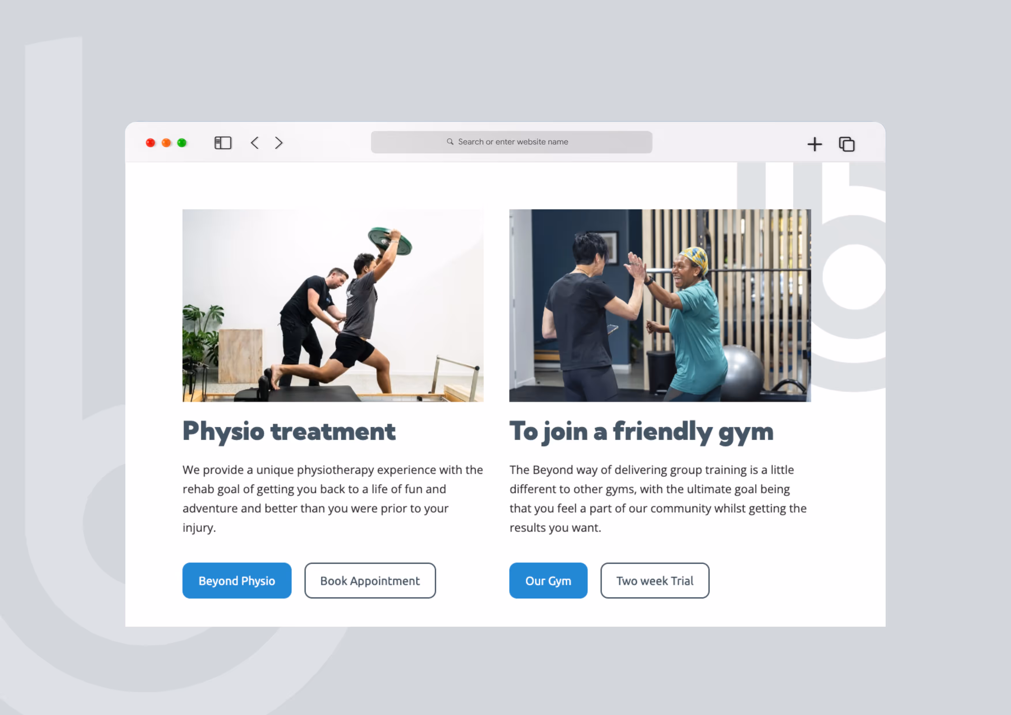
Beyond is a physio clinic and gym in the heart of Tauranga CBD. Providing a great space for like minded adventurous folk
I’ve been a member at Beyond for a number of years now, enjoying their classes, working hard and making some great friends and when owner Cormac asked if I’d be interested in working on a new website I of course jumped at the chance.
The business was in a bit of a transitional phase with the previous joint owner leaving, a new venue and plenty of change so I suggested perhaps it’s a chance to look at updating the brand to signify that step into the new. We didn’t feel the brand needed a massive overhaul, just modernising alittle with a bit of a face lift. We used a similar colour palette, matching that of the new venue as well as updating the tagline within the logo to match closer to the services offered by Beyond.
Cormac was keen to keep the icon so we worked on creating something that again was more modern and mature yet still remained recognisable as Beyond. We’ve worked to use the icon within marketing so it plays a more important role for that all important brand recognition. The font we chose gives a feeling of more authority and confidence and believe we’ve evolved the brand in a positive way that works well with the new website.
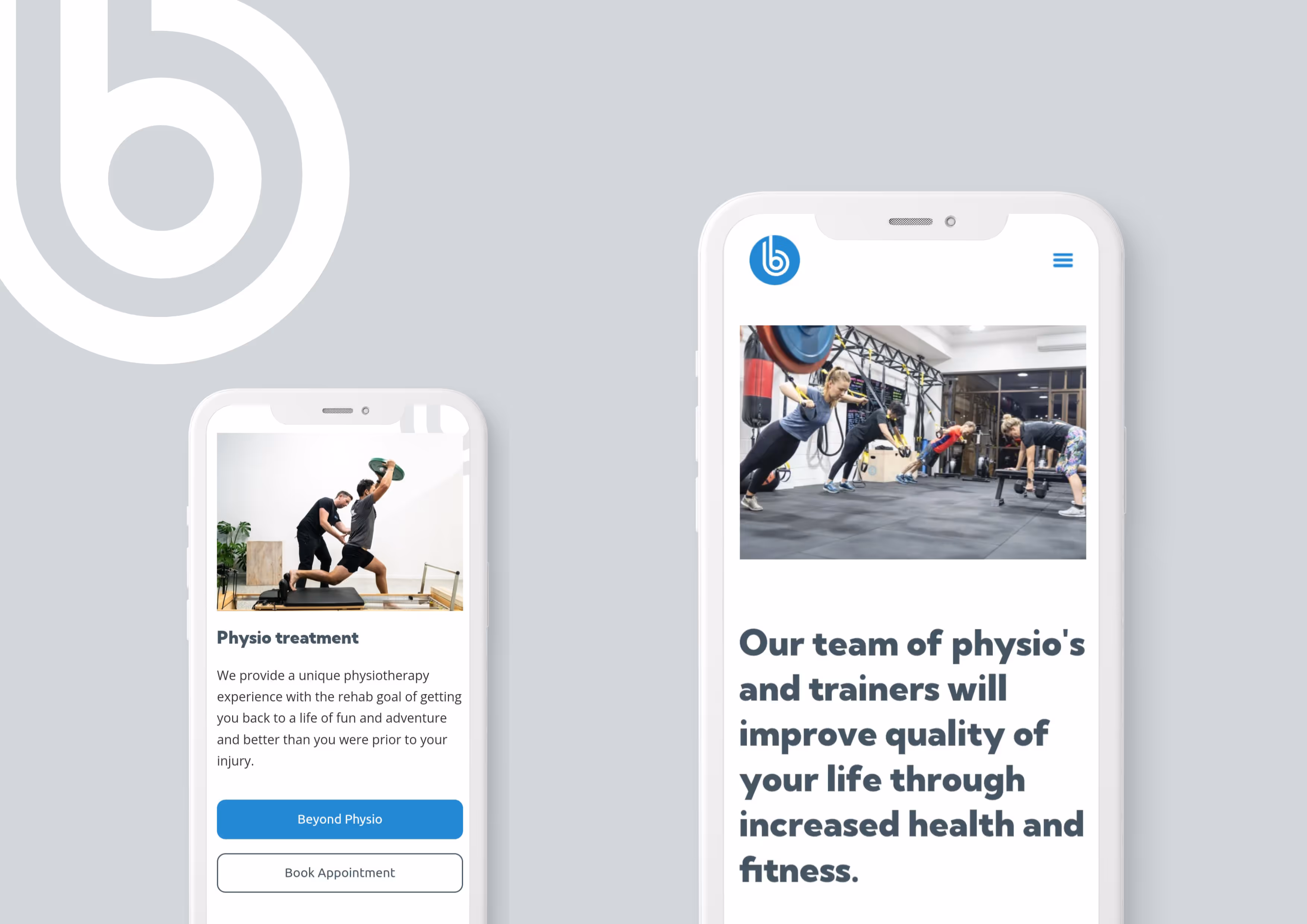
The website is much more indepth than the previous, highlighting what physio services Beyond offer as well as really highlighting the gym side of the business as a way of attracting more clients with a real focus of the friends community environment that’s offered as well as the variety of classes offered each day.
Working with Beyond was great and we’re really pleased with our work and how the website and brand evolution turned out.